
How to Coordinate Renovation Finishes Well
You can spend generously on stone, tapware, tiles and joinery, then still end up with a renovation that feels slightly off. That usually happens when people choose each item in isolation. If you want to know how to coordinate renovation finishes properly, the real task is not finding attractive materials. It is creating relationships between them so the room reads as one resolved composition.
This matters most in kitchens, bathrooms, laundries and living spaces where hard finishes sit close together and are used every day. A benchtop is not just a benchtop. It changes how the cabinetry reads, how the floor feels, how reflective the splashback should be, and whether the space feels calm or busy. Good coordination is a design exercise, not a shopping exercise.
How to coordinate renovation finishes starts with hierarchy
The most common mistake is giving every finish equal visual importance. When everything tries to be the hero, nothing settles. A well-composed room usually has a clear hierarchy - one dominant finish, one or two supporting finishes, and a small number of accents.
In a kitchen, the dominant finish may be the joinery colour because it covers the most area. In another project, it may be the timber floor if that runs throughout the home and sets the tone for the entire interior. In a bathroom, the dominant finish is often the wall tile or stone because it occupies the main field of view.
Once that lead element is identified, the other selections become easier. You are no longer choosing ten independent products. You are building around a primary finish and asking each additional material to play a specific role. Some should soften, some should sharpen, and some should simply recede.
Begin with fixed and neighbouring elements
Before looking at samples, step back and assess what is already committed. In renovations, finishes rarely exist in a vacuum. There may be existing floorboards, window frames, paint colours, a retained sofa, or a nearby hallway that visually connects to the new space. These elements have influence whether you acknowledge them or not.
This is where many showroom-led selections fall short. A material may look appealing under display lighting, then feel disconnected once installed beside your actual flooring, natural light and room proportions. Coordination needs to happen in context.
If the floor is staying, that finish should usually be one of the first reference points. The same applies to large retained surfaces and any item that repeats through the house. It is far easier to choose cabinetry, stone and tiles around an existing oak floor than to pretend the floor does not matter and try to force harmony later.
Warm, cool and neutral are not enough
People often reduce finish selection to warm versus cool tones. That is useful, but incomplete. Two warm materials can still clash if one has a pink base and the other leans yellow. Two greys can fight if one reads green and the other blue. Good coordination depends on undertone, not just general colour family.
That is why sample comparisons matter. Put materials side by side in natural daylight, then again in evening light. A stone with subtle beige veining may help a white kitchen feel grounded. A colder white stone beside a creamy cabinet can make the cabinetry look aged or dirty, even when both products are expensive and technically high quality.
Limit the palette, then vary texture
One of the most reliable ways to coordinate finishes is to reduce the number of colours and allow texture, sheen and pattern to create interest. This approach gives a space depth without visual noise.
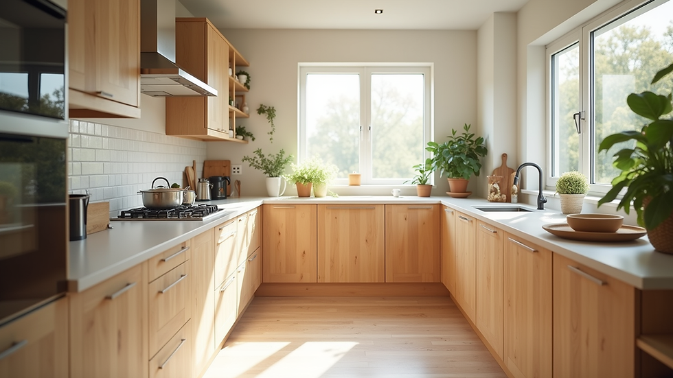
For example, a restrained palette of warm white joinery, pale stone, brushed metal and mid-toned timber can feel rich when each finish has a different surface quality. The cabinetry may be satin, the stone softly honed, the timber lightly grained, and the tapware brushed rather than polished. The room becomes layered instead of flat.
By contrast, too many competing colours often create tension. Timber veneer, veined stone, patterned tiles, coloured joinery, black fixtures and a decorative splashback can all work individually, but not necessarily together. Editing is a design skill. It is often the missing link between a room that looks expensive and one that actually feels resolved.
Pattern needs breathing room
If one finish has strong movement, let another be quiet. A dramatic stone with heavy veining usually pairs best with simpler cabinetry and restrained tiles. A highly figured timber veneer may need a calmer benchtop. Pattern can be beautiful, but it needs contrast in intensity, not just contrast in colour.
This is especially important in compact rooms. In a small ensuite or laundry, every surface is close to the eye. Too much variation reads as clutter very quickly.
How to coordinate renovation finishes across different rooms
Homeowners often focus on each room separately, but the better question is how the spaces connect. A kitchen, pantry, laundry, bathroom and living zone do not need identical finishes, though they should feel related. The house should have a design language, not a series of isolated decisions.
That continuity can come from repeated tones, shared timber species, similar metal finishes, or a consistent approach to joinery detailing. You might use a warmer white throughout, repeat brushed nickel in several rooms, or carry the same timber veneer from kitchen feature joinery into a living room unit. The result is not sameness. It is coherence.
Where clients often go wrong is trying to make every room special in a different way. One room becomes grey and minimal, another warm and textured, another bold and moody. Each may be attractive on its own, but together they can feel unsettled. Better interiors have variation with discipline.
Use contrast with purpose
Contrast is essential, but it should be controlled. Without contrast, a room can feel bland and shapeless. With too much, it can feel fragmented.
A practical way to think about contrast is by balancing light and dark, smooth and tactile, matte and reflective. If your cabinetry and stone are both light, perhaps the floor or metal finish introduces weight. If the room already has dark flooring, you may not need heavy charcoal joinery as well. The right move depends on the size of the room, the amount of natural light and the visual connection to adjoining spaces.
Black fixtures are a good example. They can provide definition, but they are not automatically the right answer. In some schemes they sharpen the palette. In others they look imposed because there is no supporting dark element elsewhere in the room. A finish should feel integrated, not fashionable.
Don’t forget sheen
Sheen changes how colour is perceived. A high-gloss surface reflects more light and appears sharper. A matte or honed finish feels softer and more architectural. This affects coordination just as much as colour does.
A bathroom with glossy wall tiles, polished stone and shiny chrome can feel hard if every surface reflects. Introducing a softer floor tile or brushed tapware can bring balance. Likewise, an all-matte kitchen may need one slightly more reflective element so the palette does not become dull.
Samples are useful. Full composition is better.
Individual samples help, but they only tell part of the story. The challenge is seeing proportion. A tiny tile sample may seem subtle until it covers an entire wall. A stone sample may look dramatic in hand, then disappear once spread across a large island.
This is why professional finish coordination is not just about product knowledge. It is about composition, scale and practical judgement. An experienced designer is looking at how much of each finish will be visible, where the eye will land first, and how the materials will sit with lighting, shadows, edges and joinery lines. That is very different from simply selecting attractive products from a display board.
At 5 Rooms, this is exactly where specialist design adds value. Joinery-heavy renovations do not benefit from disconnected product decisions. They need finish selections tied to layout, proportion, detailing and real use.
Practical rules that prevent expensive mistakes
There are a few principles worth holding onto. Keep the palette tighter than your first instinct. Compare undertones in daylight. Choose one feature, not five. Let repeated elements carry cohesion through the home. And always test finishes against the actual items they will sit beside, not what they looked like in a showroom.
If you are torn between two options, the quieter one is often the safer long-term decision, especially for large surfaces. Statement choices can work beautifully, but they need enough design discipline around them to avoid visual fatigue.
The other reality is maintenance. Some finishes look superb in photos yet are unforgiving in family life. Very dark cabinetry can show fingerprints. Highly polished surfaces can emphasise water marks. Pale grout may need more care in a busy bathroom. Good coordination should account for how the room will live, not just how it will photograph.
A finished interior should feel calm, intentional and easy to inhabit. When the materials are properly coordinated, most people will not point to one specific selection and say that is why it works. They will simply feel that everything belongs. That quiet sense of order is usually the clearest sign the design has been properly thought through.



Comments